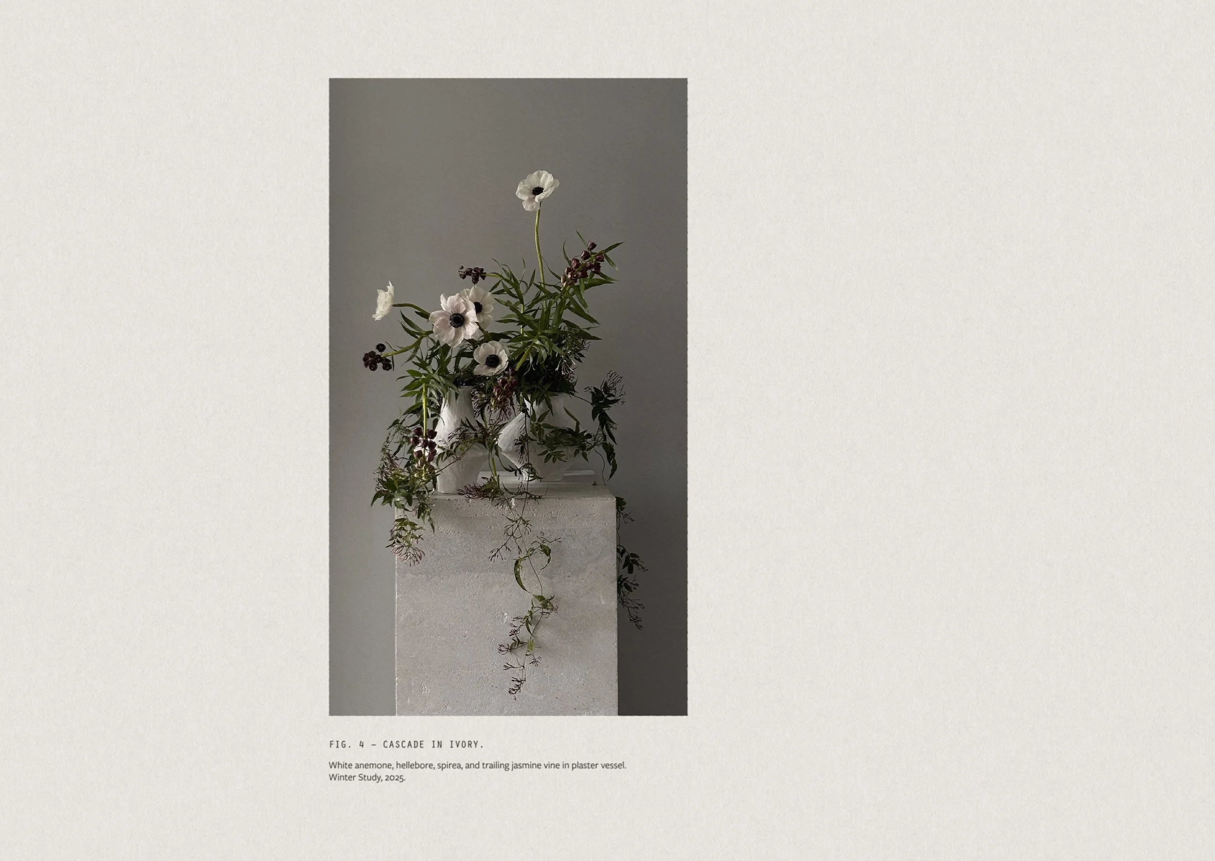
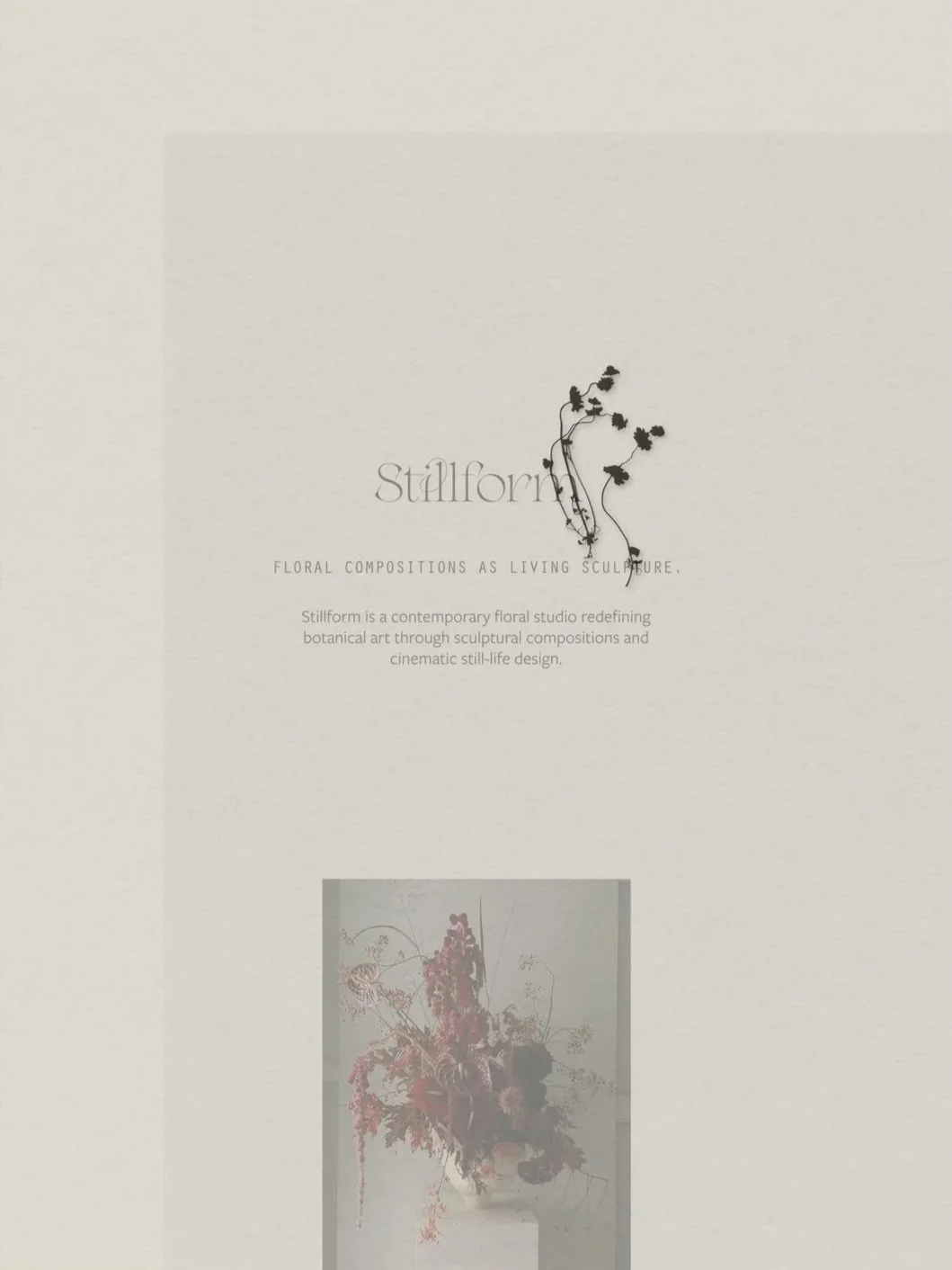
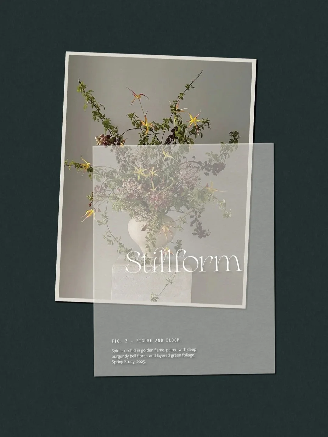
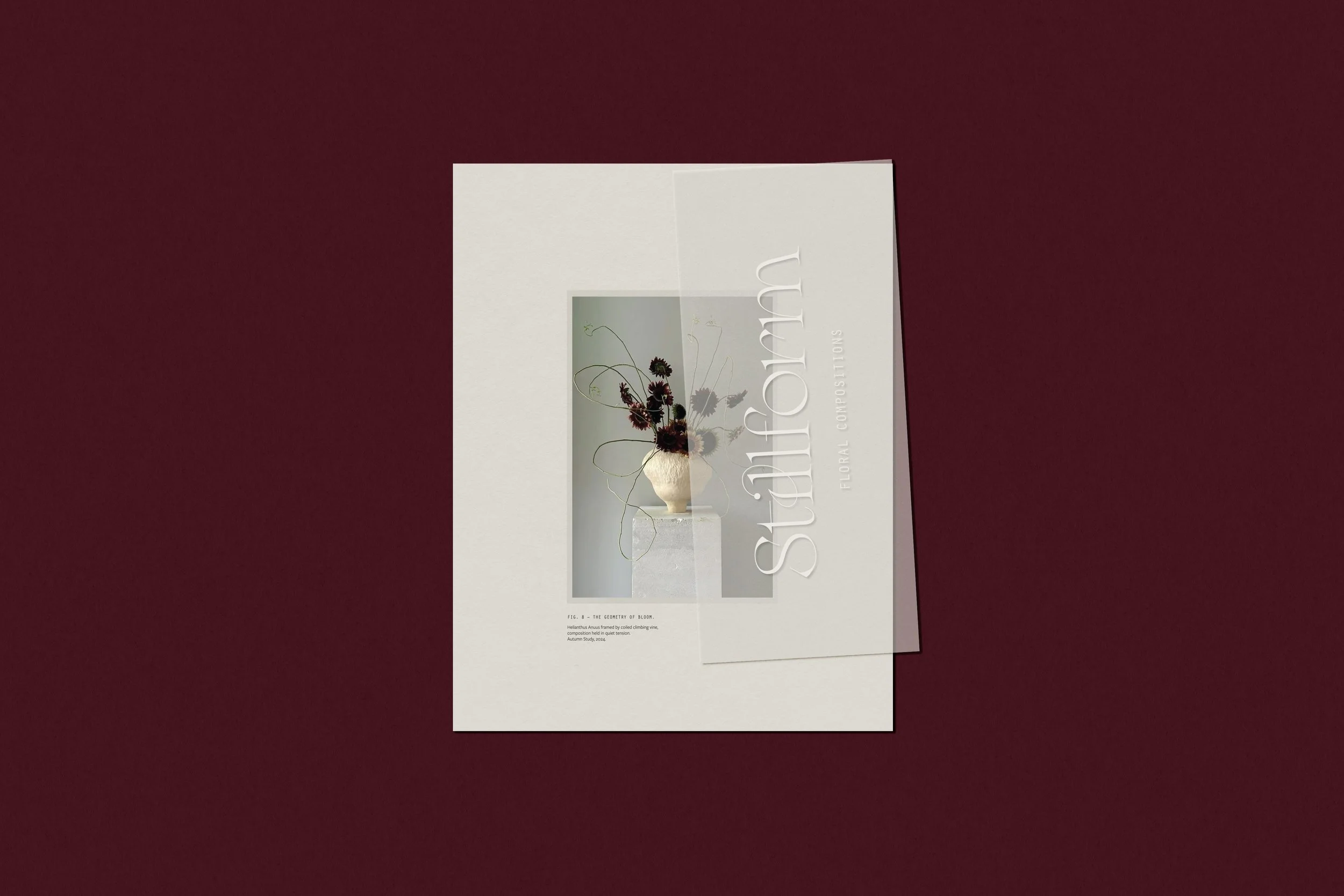
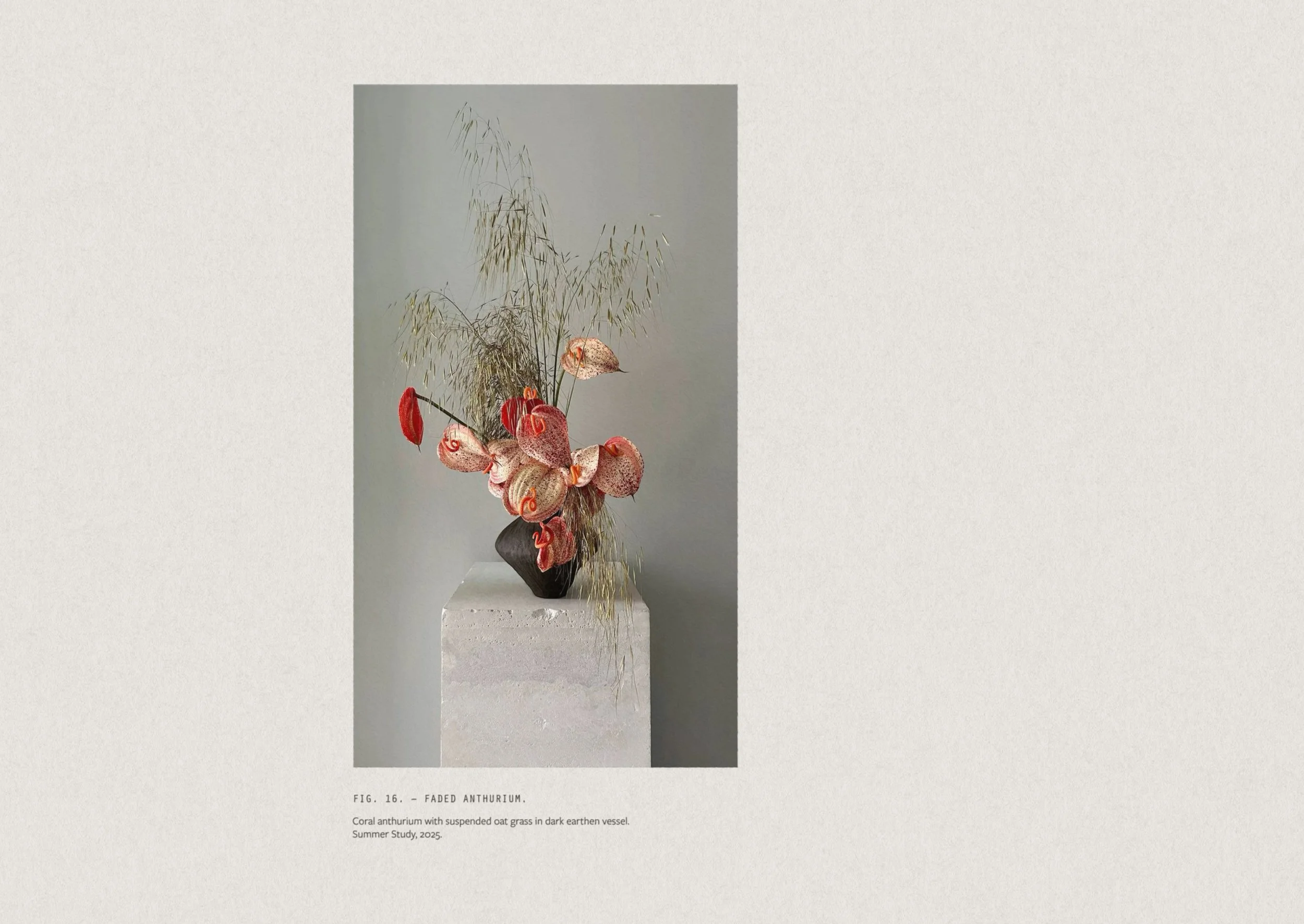
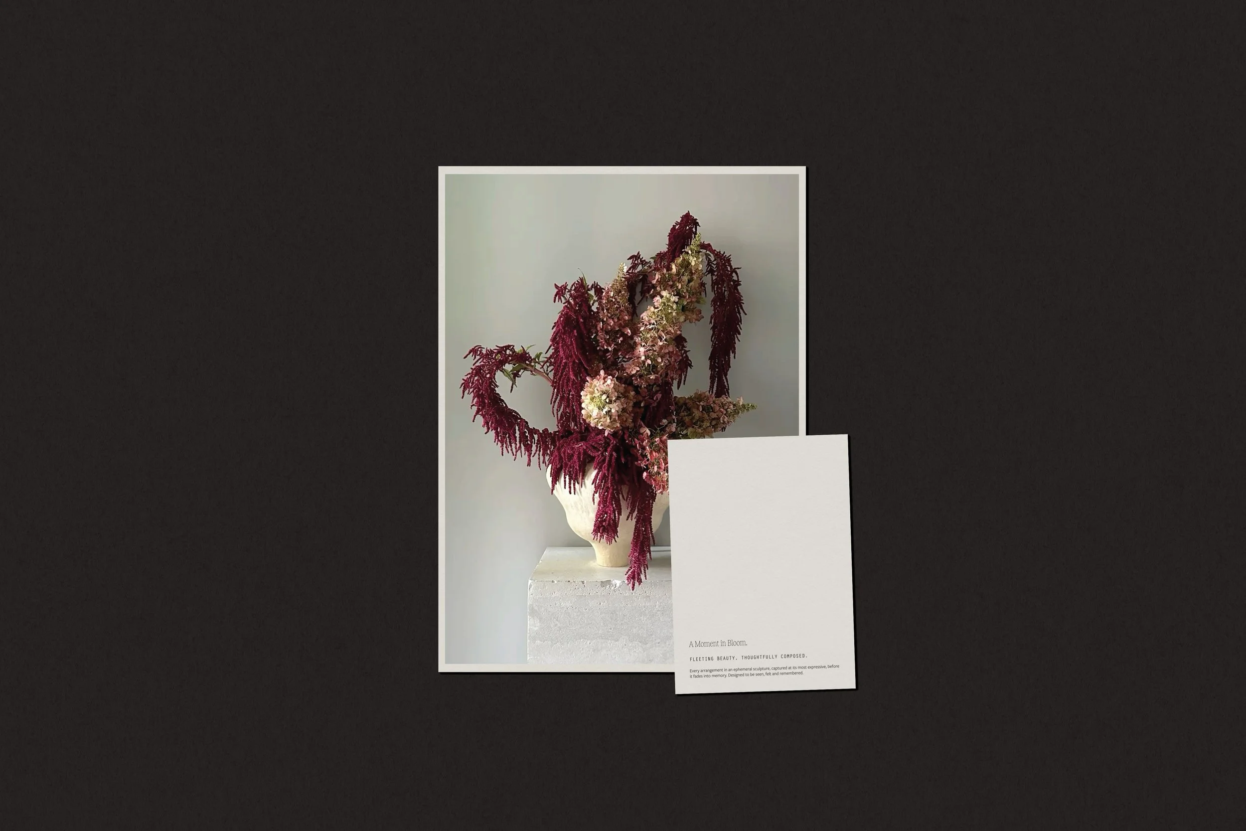
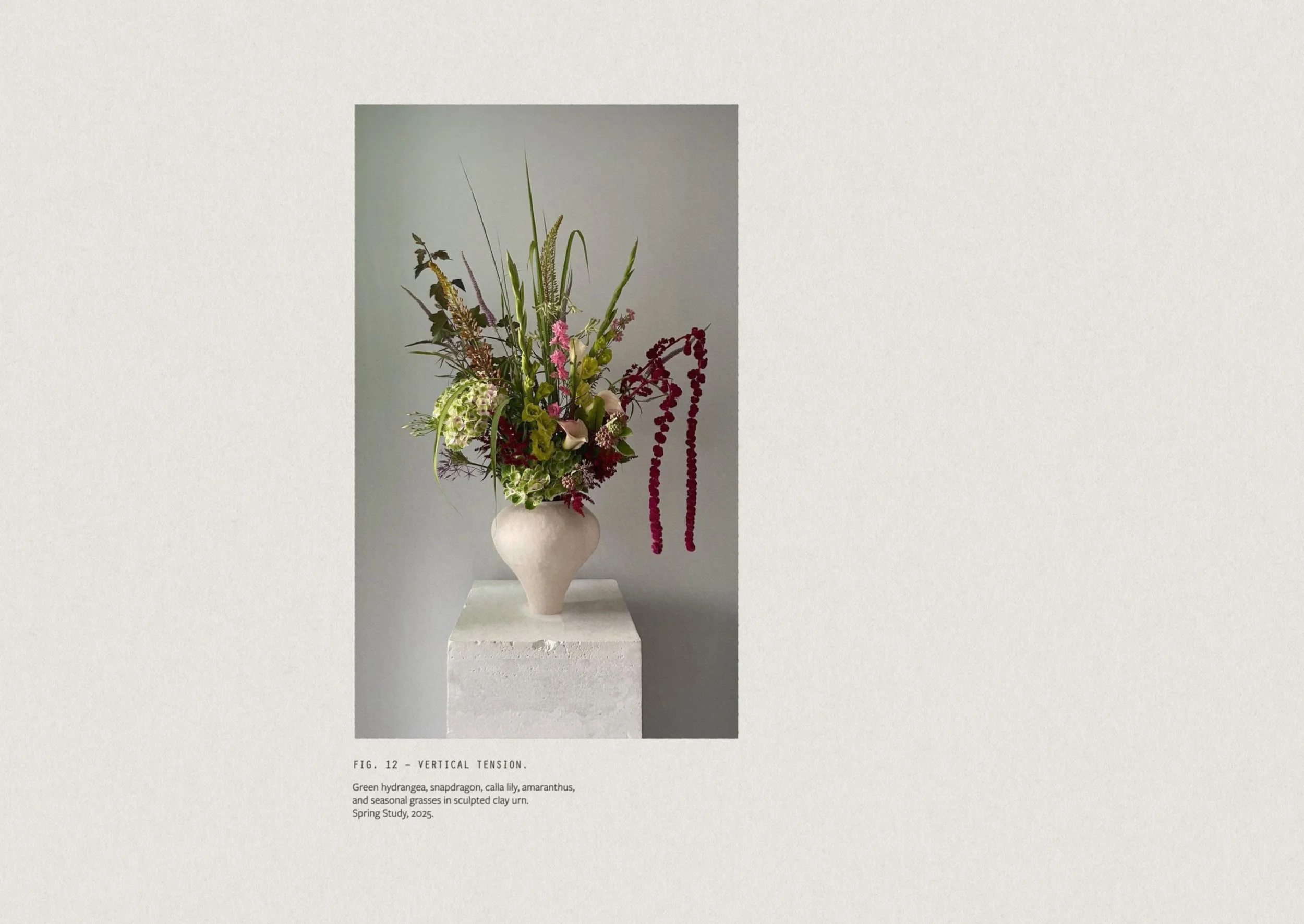
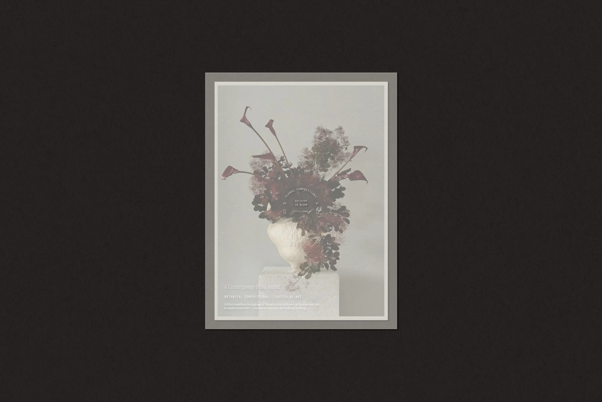
Stillform exists at the intersection of art and nature — a contemporary floral studio that approaches each composition as a living sculpture rather than a traditional arrangement. Inspired by still-life paintings and modern design, every piece becomes a study in balance, texture, and form. Guided by impermanence, each arrangement embraces asymmetry, gesture, and decay as integral expressions of beauty. It’s not about perfection or prettiness, but about capturing emotion and movement through florals where composition is a fleeting exhibition, a momentary collaboration between artistry and bloom.
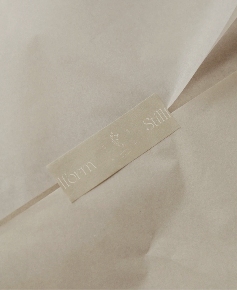
BRAND DEVELOPMENT / PRINT COLLATERAL
CREATIVE DIRECTION
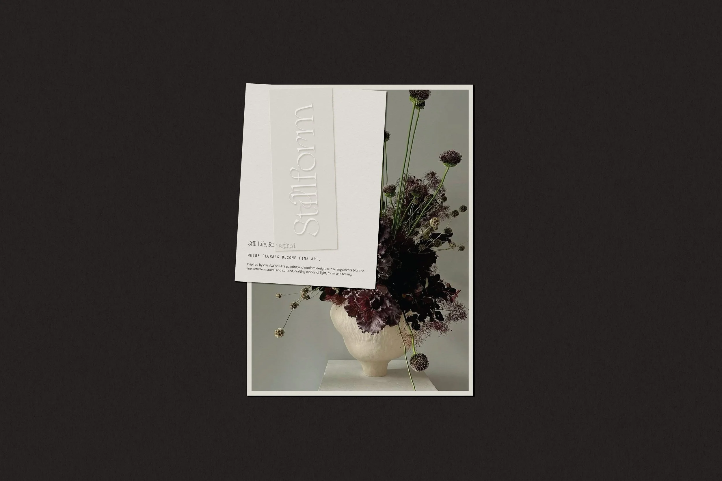
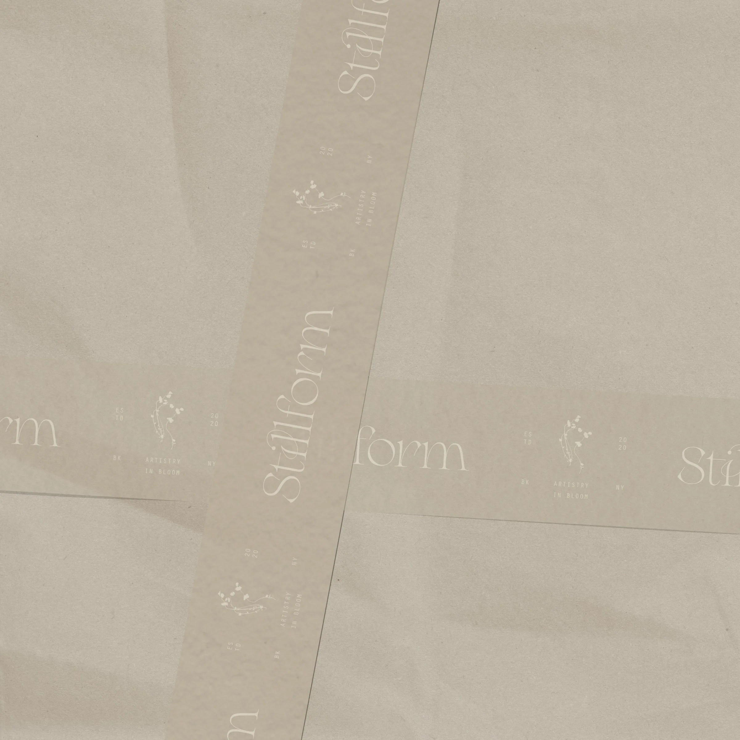
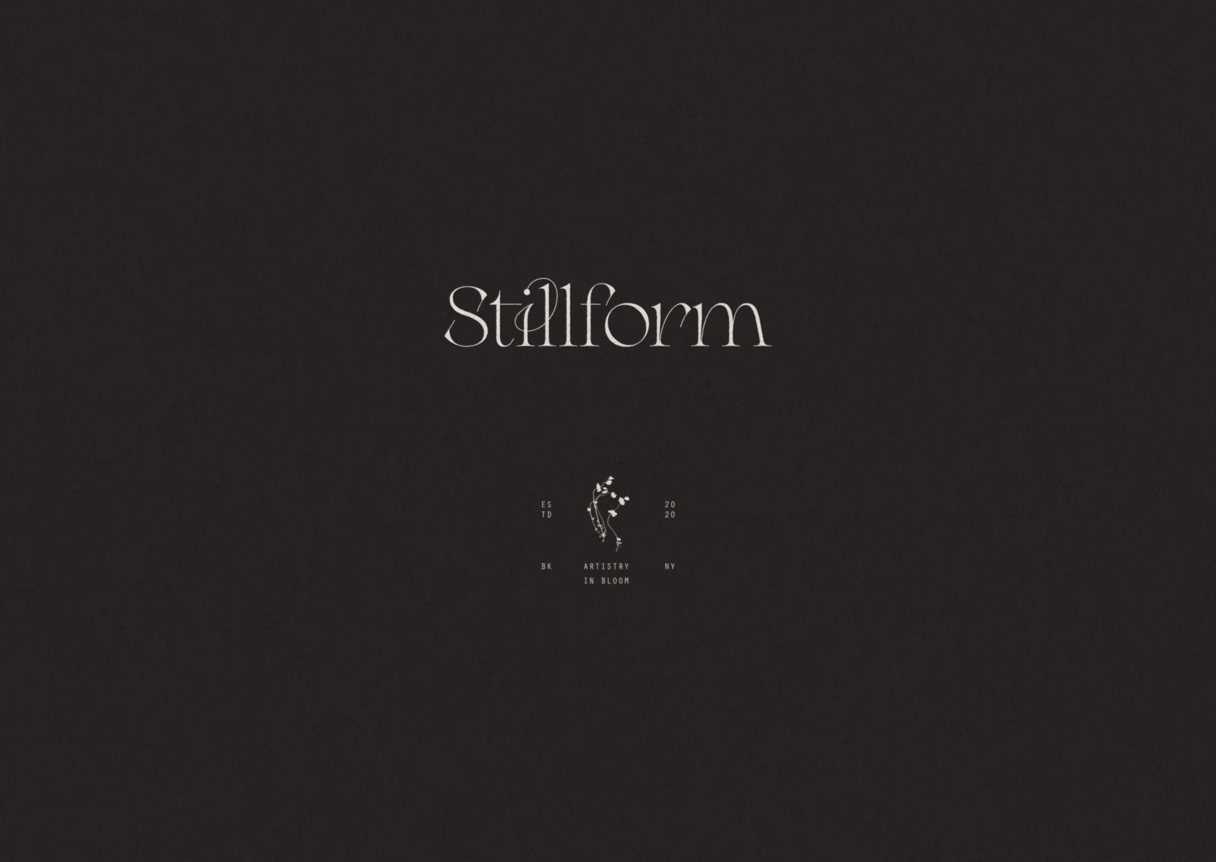
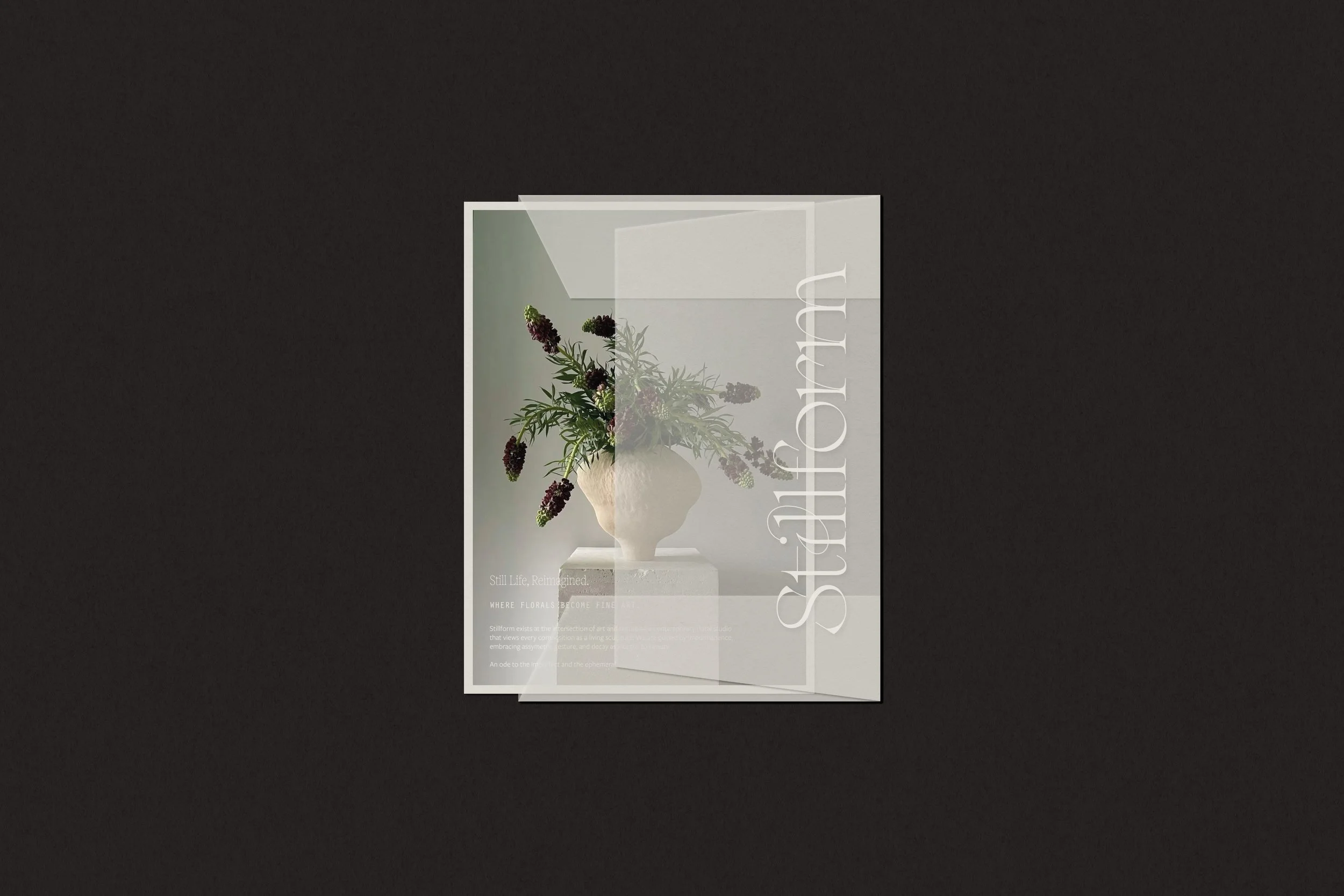
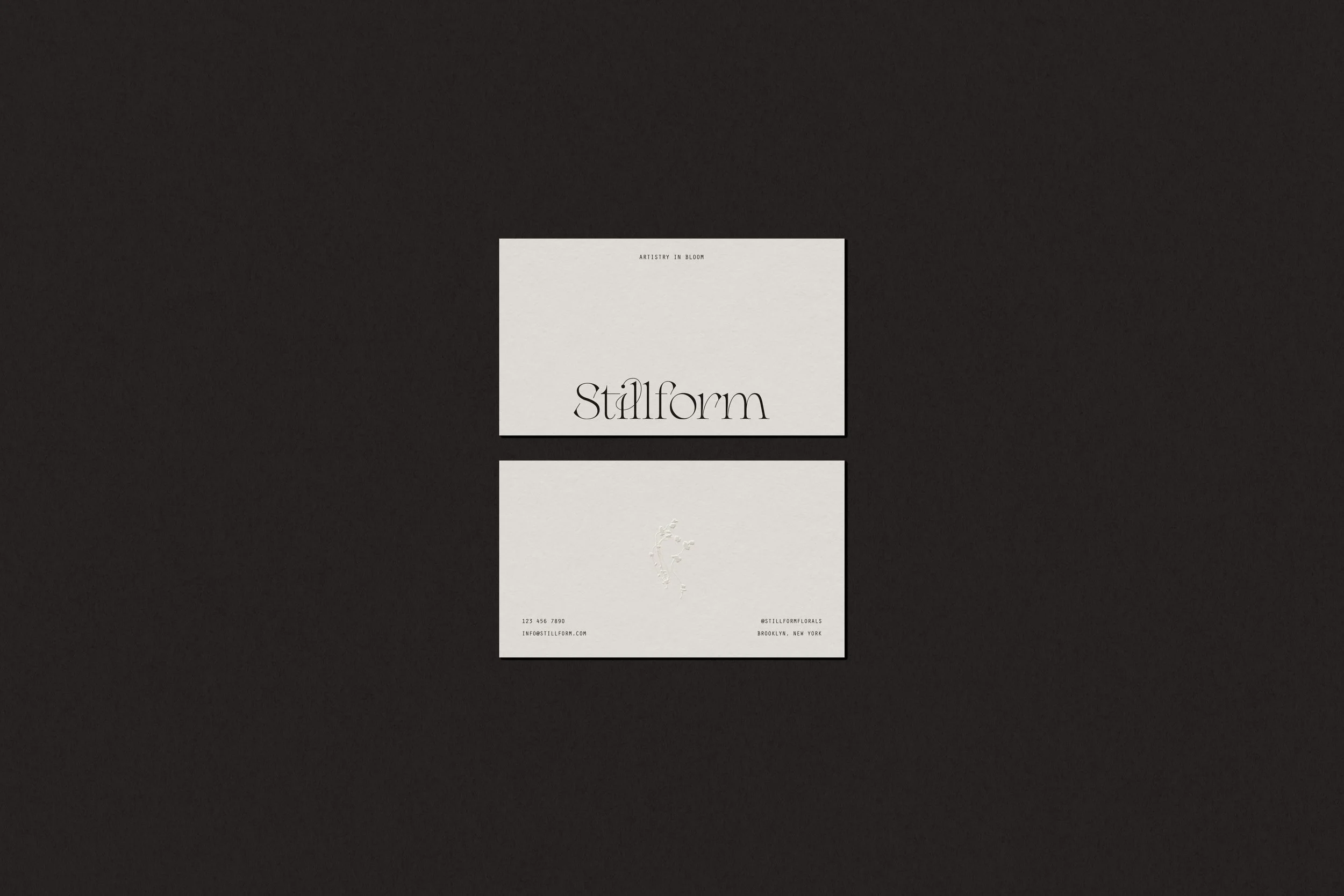
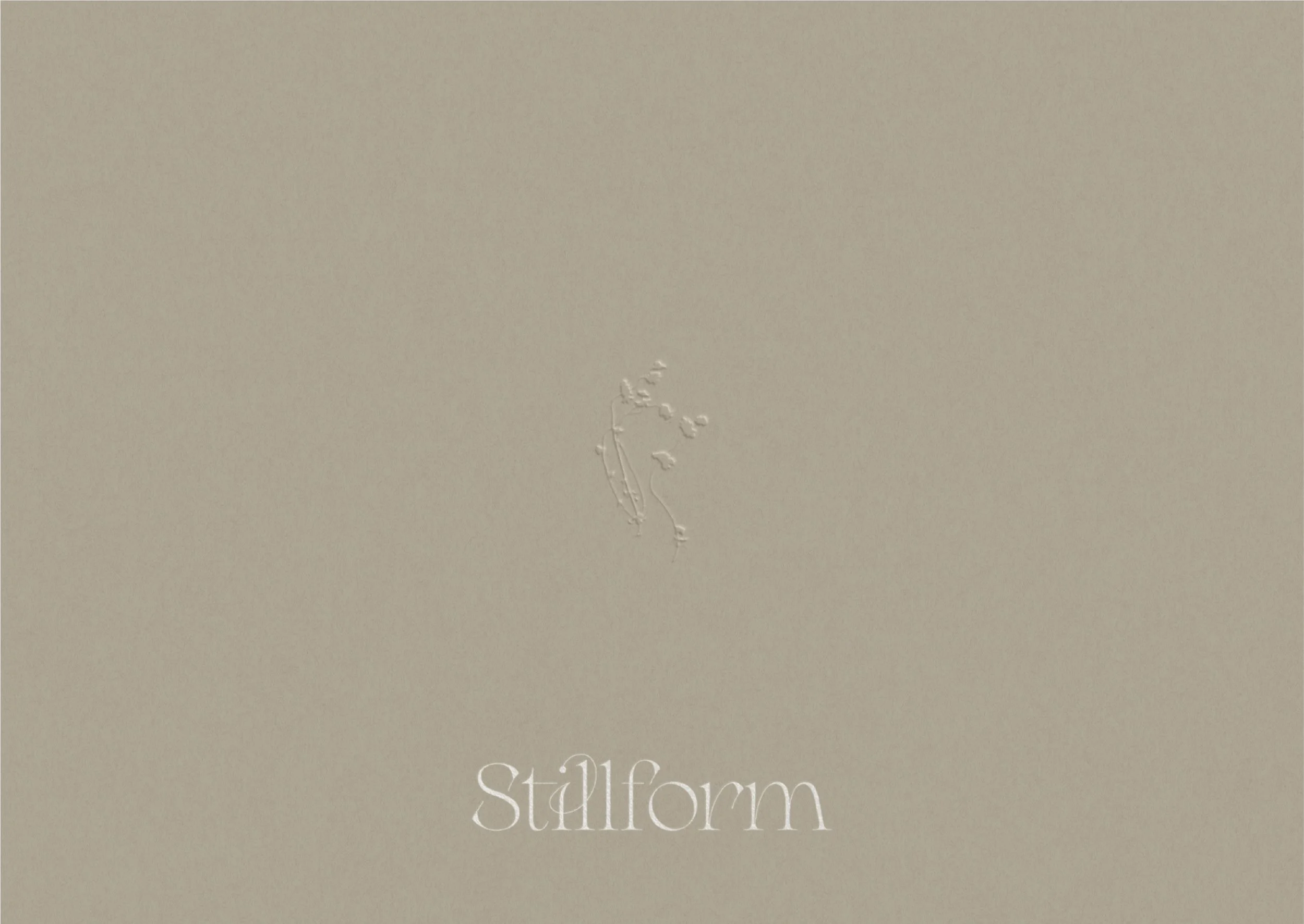
The creative direction and design strategy for Stillform draw heavily from contemporary art spaces, shaping a brand identity that feels expressive yet restrained. The logo, designed with an elegant serif typeface with subtle, expressive ligatures, conveys a sense of romance and movement, echoing the organic nature of the floral arrangements. This is balanced by a structured, monospaced secondary typeface inspired by gallery labels and archival texts, grounding the brand in a more modern and editorial context. A collection of refined brand marks and a hand-drawn wildflower illustration further explore the tension between control and wildness, pairing the imperfect, expressive nature of the arrangements with a more disciplined visual identity. Together, these elements form a cohesive brand identity that positions Stillform as an artful, gallery-inspired floral studio where each arrangement is treated as a living work of art.
MODERN / ROMANTIC / ARTFUL / REFINED / GALLERY-LIKE